CodementorX
Period: 2018
Expertise: product design
Team: Yu-tang Cheng (PM), Tong-Jain Ho (FE), Maxis Kao (FE), Yang-Hsin Lin (BE), Shih-Yu Chu (D)
Freelance Software Developers Hiring Platform Redesign
Problem
CMX is a SaaS for hiring freelance software developers on-demand. However, the hiring process highly relies on salespeople. As CMX was growing fast, the workload for salespeople became overwhelming. That means it’s hard for the sales team to maintain their conversion rate of turning a lead into a client, and it’s conceivable that the user's experience went bad as well.
Outcome
Our ultimate goal was to automate the hiring process as much as possible. We wanted the dashboard to be self-sufficient so users can complete most steps of the hiring process on their own. Over a few months with several sprints, I redesigned the “request” and “contract page”, and added new features like “team” that releases the sales team’s workload.
Project
Context
The Hiring Process
Project Goal
The Hiring Process:
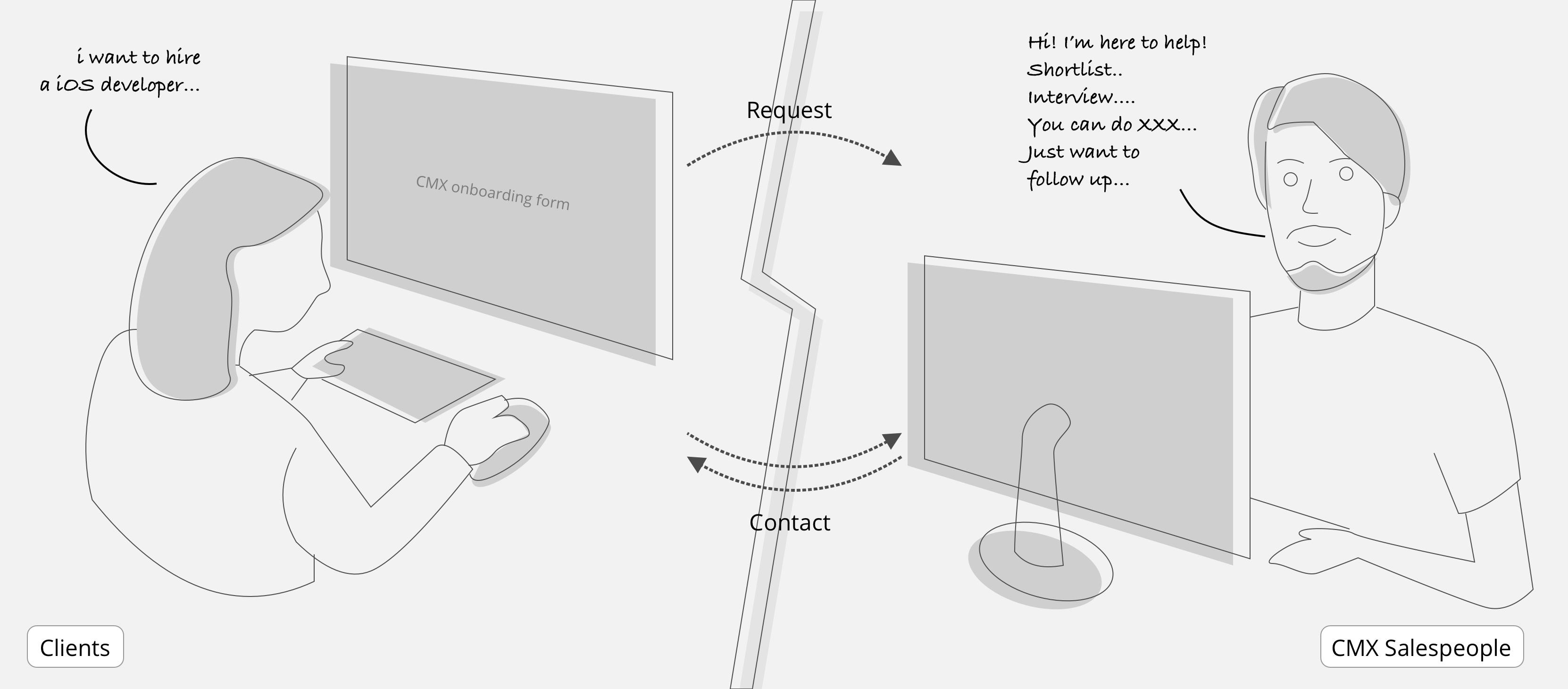
Our Salespeople Have to Hand-Hold Our Clients Through the Entire Process
To hire a developer, clients need to fill out an “onboarding” form, where they can express what kind of developers they need. Based on their response, our sales team will contact them and help them find the best match, and then the sales team will hand hold them to go through a series of tasks such as reviewing shortlists, interviewing candidates, and finally start a contract. As our business grew, all the hand-holding process was making salespeople’s workload overwhelming.
Project Goal:
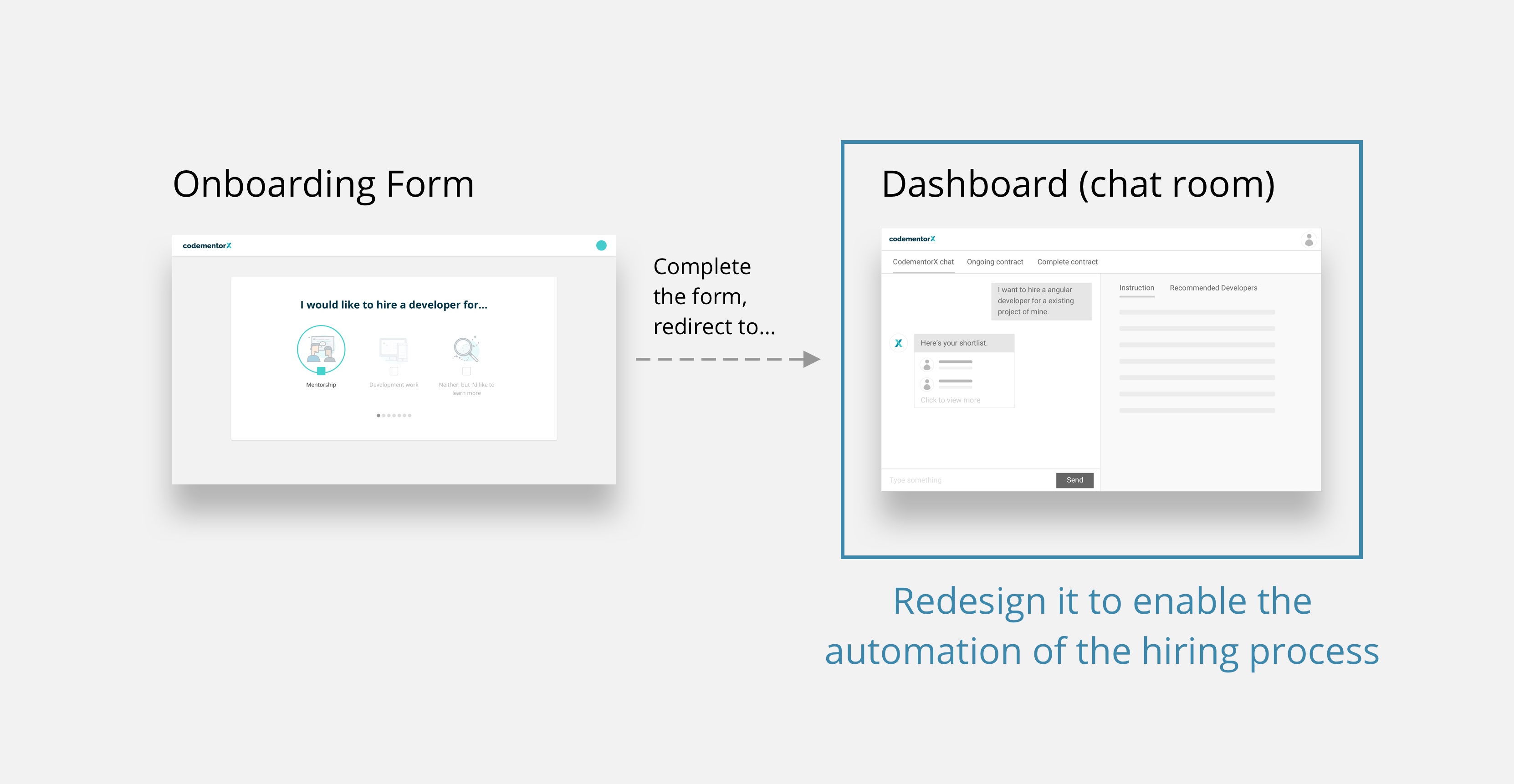
Redesign the “Dashboard” to Enable Automation of the Hiring Process
We wanted to automate the process as much as possible without changing the process. The time our sales team spent on hand-holding our clients was between after clients completed the onboarding form till they started the contract, and the “hiring dashboard” is where the clients were taken to during which period. So our goal was to look into the old dashboard, and see how we can redesign it to enable automation throughout the hiring process.
Design
Research
Interview, Feedback, and Observation
Competitive Analysis
Interview, Feedback, and Observation:
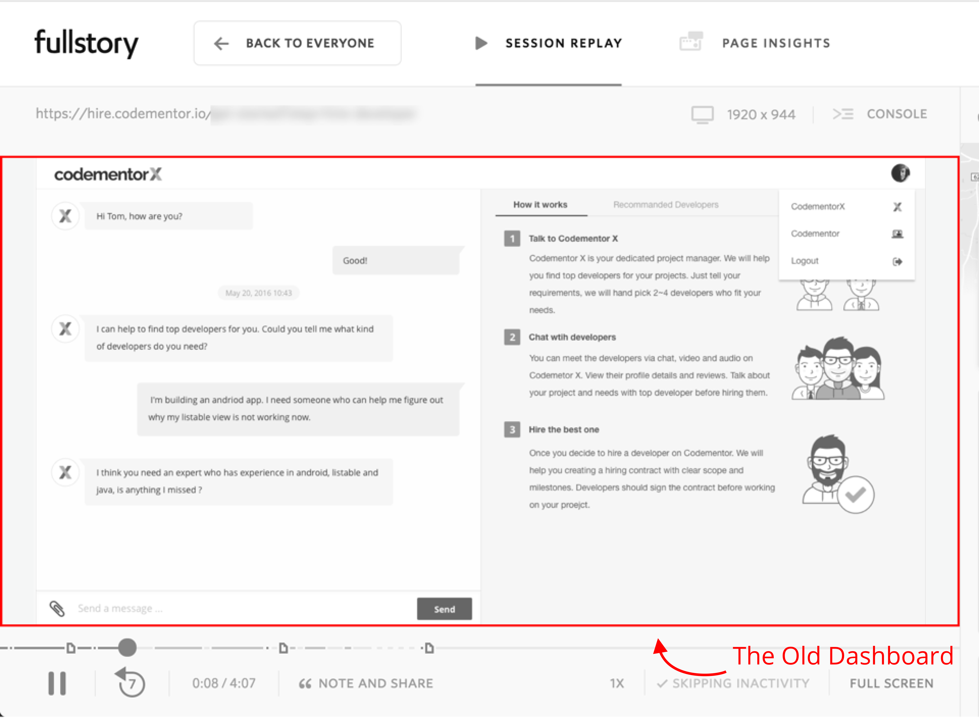
Information and Action Items of the Hiring Process was Scattered Everywhere, the “Chat Room” Dashboard was No Longer a Prefered Format, and the Demographic of Our Clients is Changing
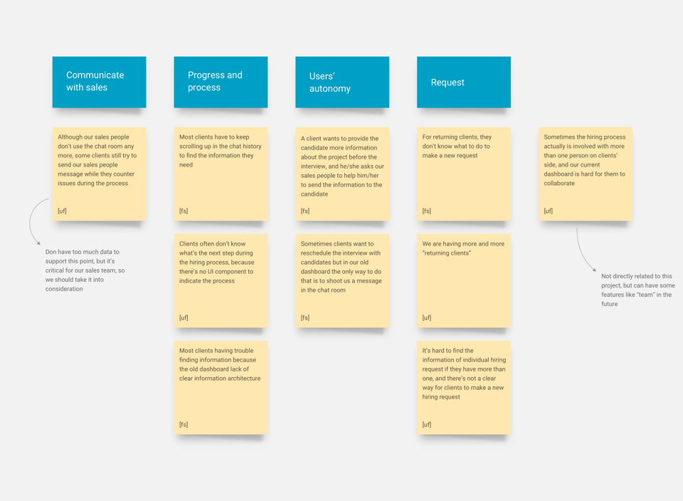
I conducted some stakeholder (salespeople) interviews, collected feedback from our support team, and observed user behavior through Fullstory to find answers to following questions: how the salespeople and clients interact with the old design, what portion can be automated, and what are the other potential problems. Detailed results:
Information regarding hiring request was hard to be found in old dashboard (chat room)
Status of hiring process was not shown in the dashboard
The old dashboard was basically a “chat room”, which was not used by our sales team for communication anymore
Most of the action items were manually sent to clients via emails
Salespeople had to spend great amount of time dealing with unexpected events because clients don’t have control over those things
Client’s demographic was changing: more returning clients and larger organization than before
Competitive Analysis:
Step by Step Progress Bar and Clear Navigation for Request and Contract Are Industry Paradigm
I also investigated how our competitors design their hiring process and corresponding interaction, especially large scale competitors such as Upwork and Toptal. The result showed that most products have a step by step progress bar that clearly shows what step the client is currently taking. They also have a clear layout and navigation for requests and contracts. Through the competitive analysis, I learned that these components would be essential in our new design.
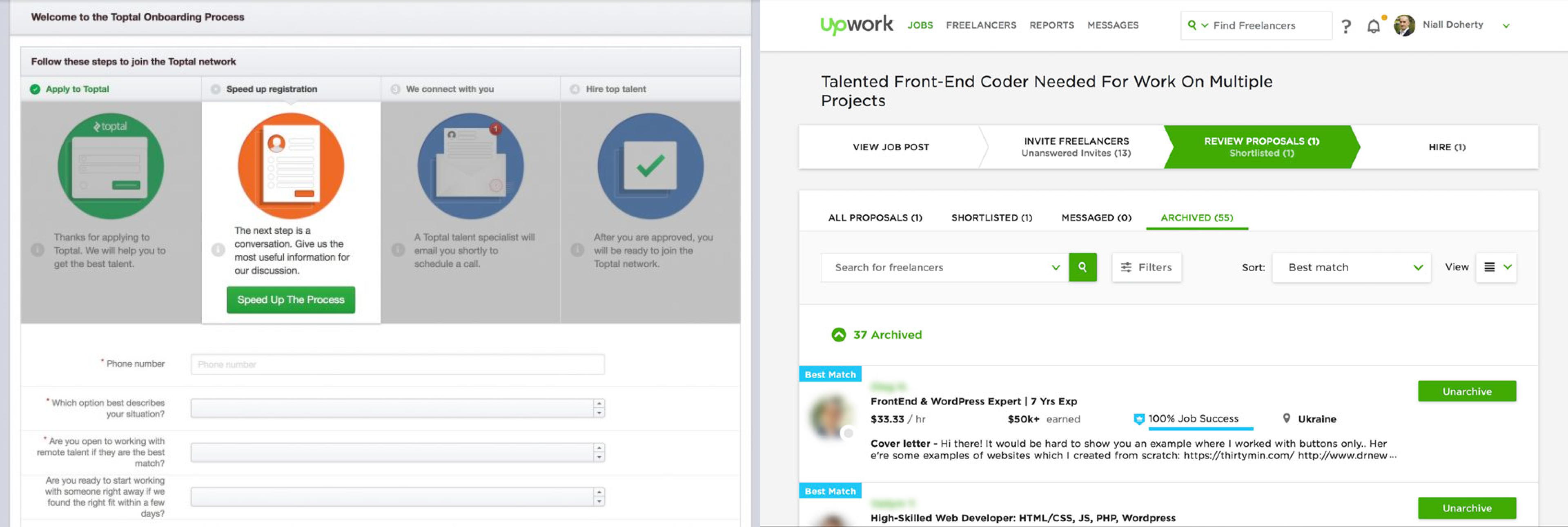
Photo from internet
Design
Strategy
Discuss Strategies with PM:
Every Information and Action Item Should be Generated by System and Clearly Displayed in the Dashboard, so Clients Can Take Action on Their Own. In Addition, We Need to Remove the "Chat Room", and Add the “Team” Feature
I discussed findings from the design research with my PM, and we both agreed that in order to automate the hiring process, the most crucial thing was to clearly show every information and action item in the dashboard. Also we need to remove the chat room which was not being used at all, and add the team feature. More details about the strategies:
Provide clear information and hiring status of hiring request, and allow client to communicate with potential developers
Allow clients to start a contract hassle free on their own and manage contracts easily
Remove chat room and replace it with a dashboard
Incorporate the “Team” features
User
Journey
Old User Journey
New User Journey
Old User Journey:
Remove Unused Screens Like “How It Works” and “Deposit”
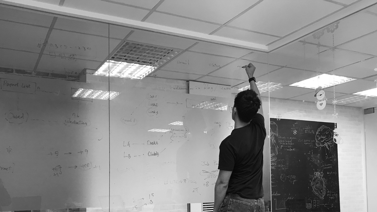
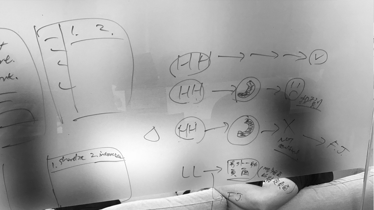
I charted a user journey map of the old dashboard and ran through it with the PM and the sales team. This helped me clarify the complex hiring process that involved lots of human factors, and identify what screens needed to be removed and what were missing.
New User Journey:
Add New Screens Like “Reschedule Calls”, “Leave Feedback”, and “Interview”. In addition, Confirm with Dev Team that “Contract” should be separated from “Request”
Based on the design strategies we came up with, I refactored the user journey, removed the unused screens, and added new screens needed for the new design. Some of the new screens/features actually existed before, but they were scattered everywhere and some were handled manually. The new user journey put them altogether in one dashboard with clear flow.
Design I:
Request Page
Layout Exploration I
Layout Exploration II
Content and Status
Interaction Detail
Iteration I
Iteration II
Layout Exploration I:
Try Different Layouts to See Which One Look Good in All Different Cases
While designing the new dashboard, I came up with four different mockups based on competitive analysis and the new user journey. I evaluated which one to go with by following criteria:
It has to look good both when the page is empty and when it’s full of content
The hiring process steps has to be clear and easy to interact with
Is it easy to navigate when there are multiple requests and contracts
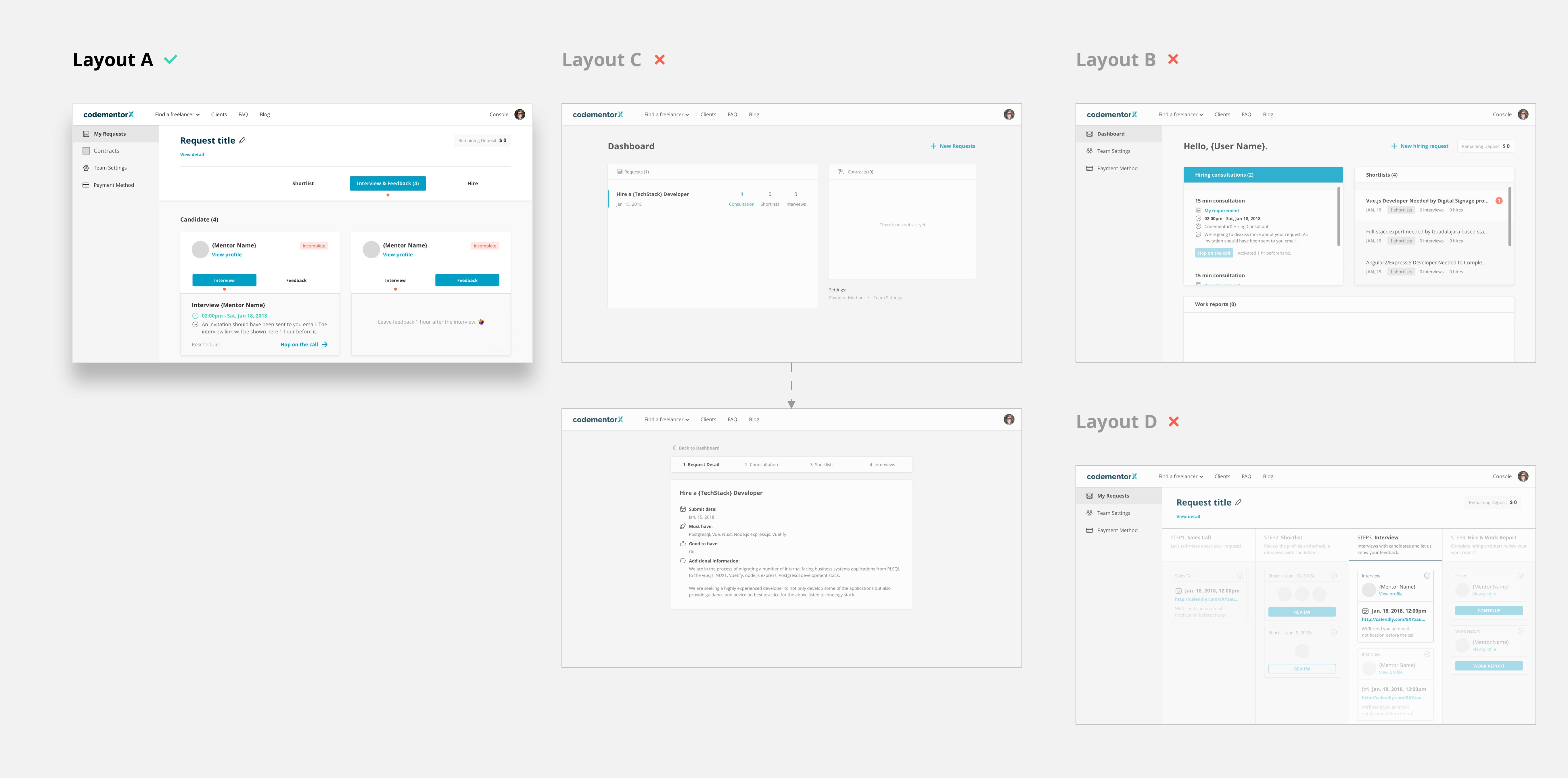
Layout Exploration II:
Display Requests/Contracts on Left Sidebar, and Show Progress Bar and Content on the Right
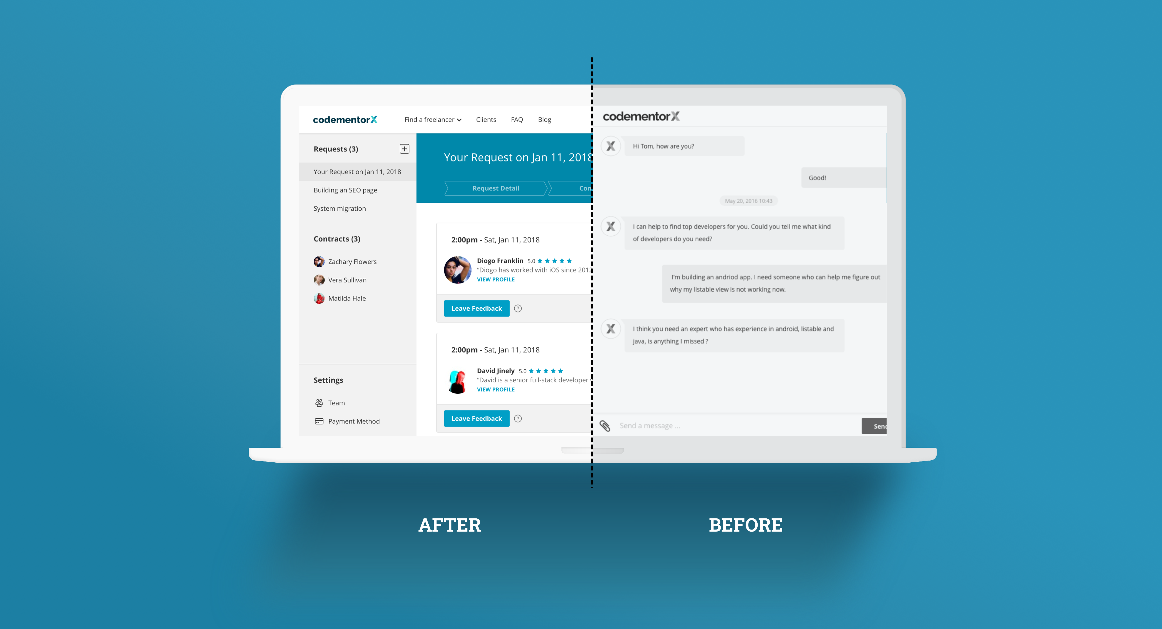
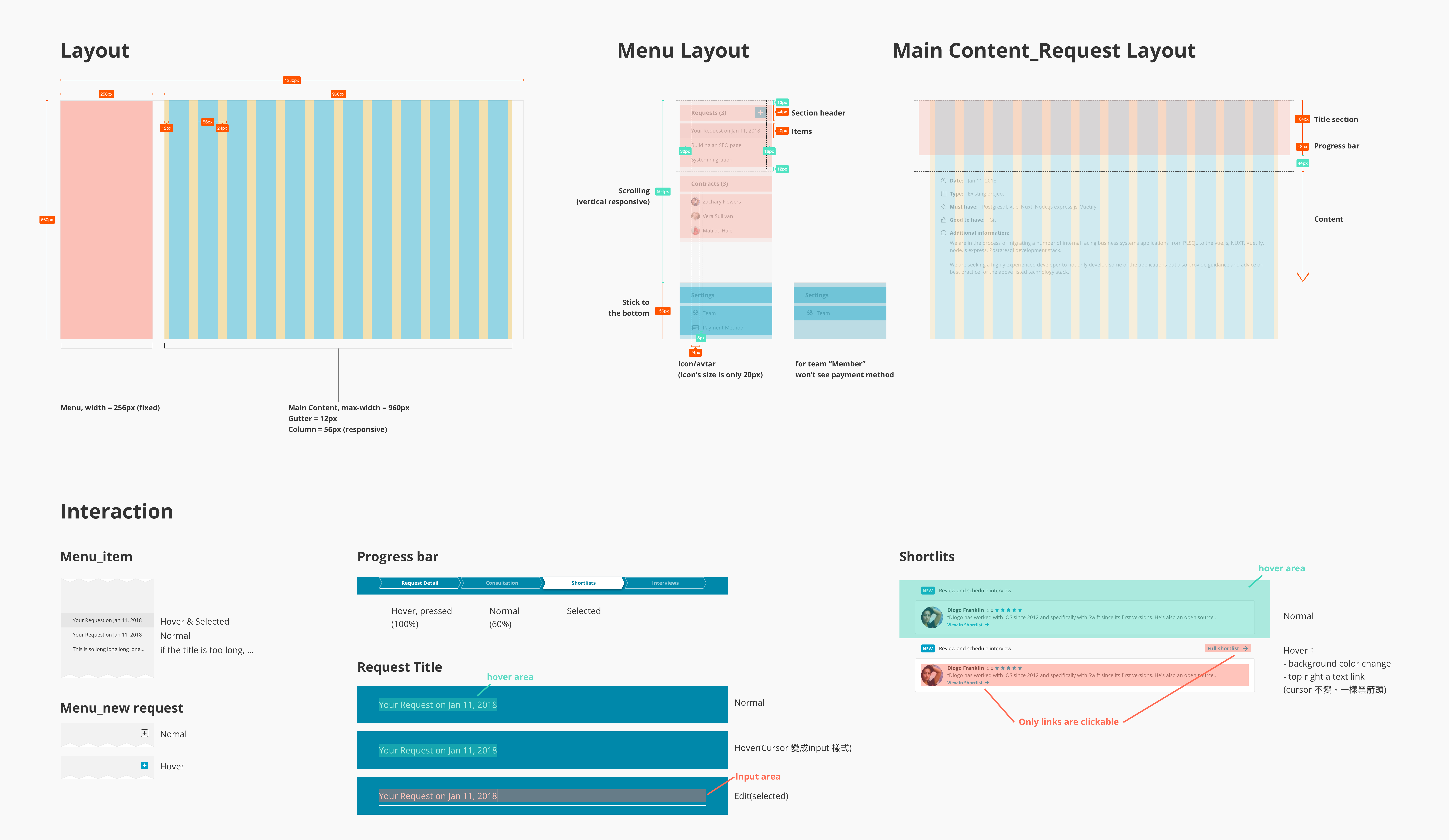
Finally I chose layout A to proceed because it uses a progress bar to present the hiring status which matches most people’s mental model of “process”. Also, it uses two columns layout design, and only shows information about a single step in the main area, meaning that it will look good in any case so users only need to focus on the information they need at a time. I then added an additional column for showing the list of hiring requests, which provided better navigation between different requests and contracts.

Content and Status:
Display Information in Corresponding Step, and Show Status
At this stage, I created a prototype to show what information should be displayed, and what status and interaction will there be in each step. In “Request detail”, I show the information that a client provided in the request form, which is not displayed in the old design. In “Consultation”, the content already existed in the old design, so I simply pulled them into the corresponding step and adjusted the layout. The “Shortlist” part also existed in the old design, but here I added status changes to each shortlist, so clients could easily tell what to focus on. Previously, the “Interview” step was completely handled manually by the sales team. Here I put them into the process bar as a final step, and each interview will also have a status, so clients could easily tell what the action items are.
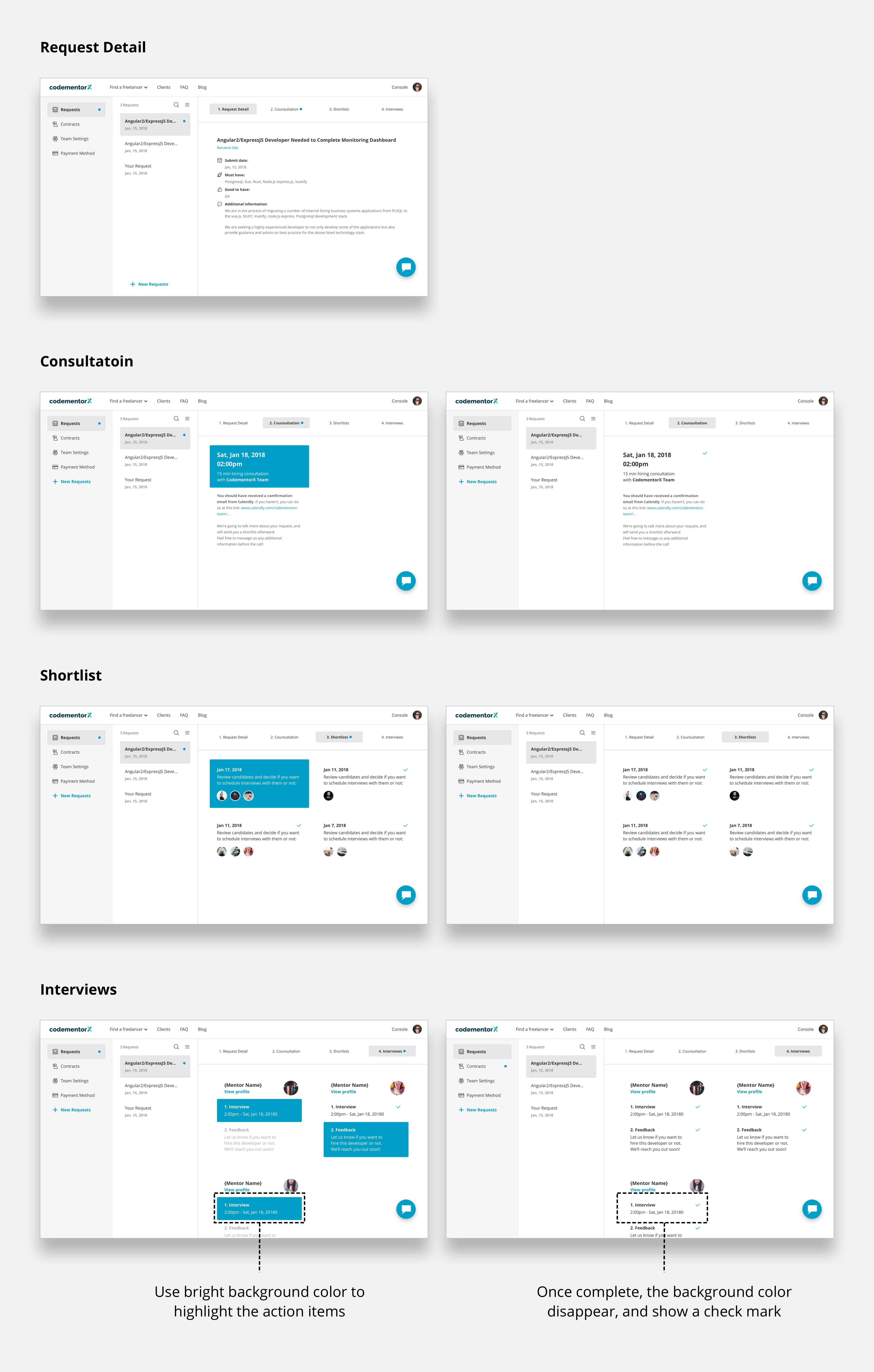
Interaction Detail:
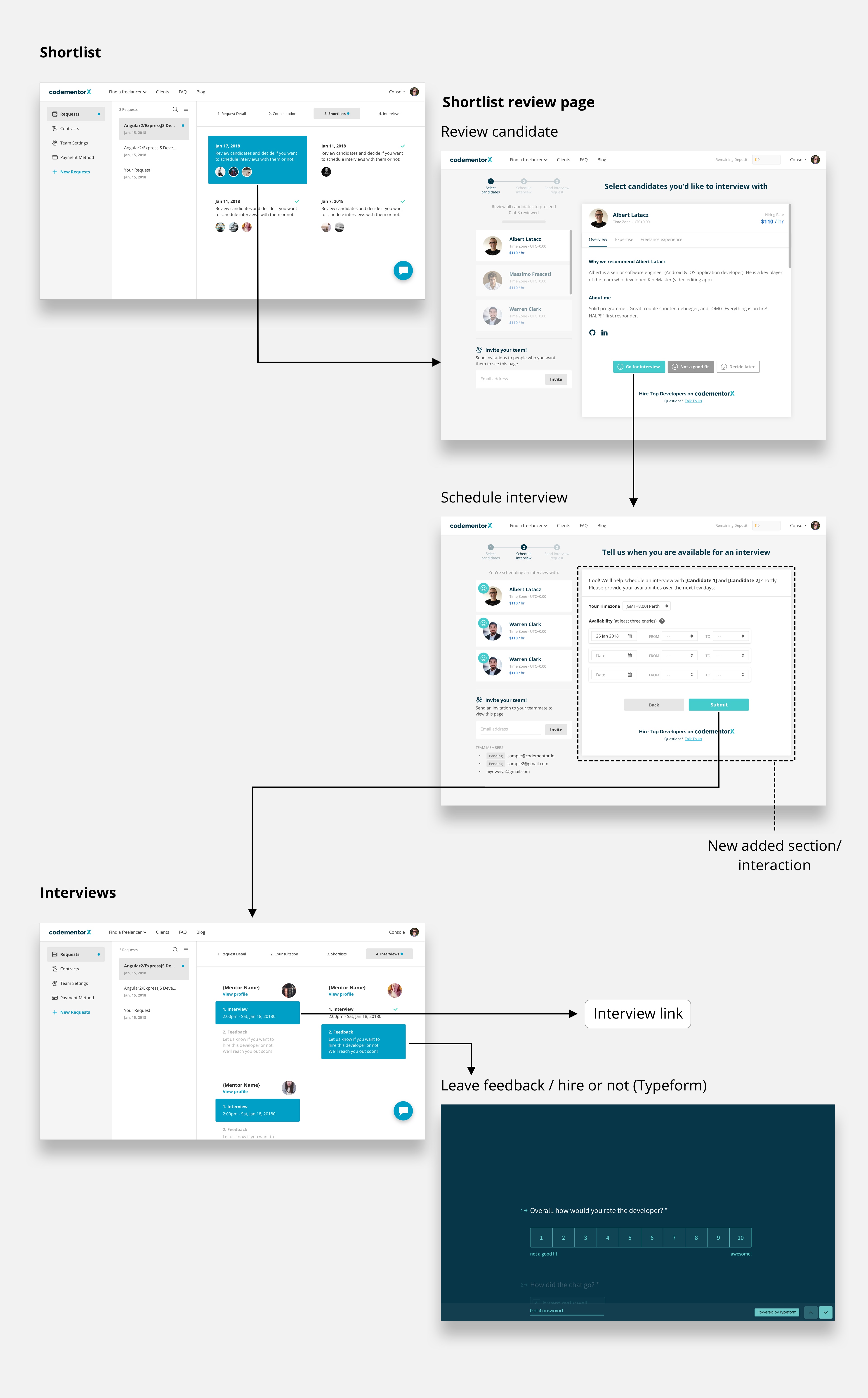
Design the Interaction of the “Shortlist” and “Interview” Step
For the interaction, in the “Shortlist” step, clients can click on the link which will take them to an external page to review the candidate, where they can schedule an interview with them if there is a match (this detail of this design is out of the scale of this project). In the “Interview” step, clients can click on “interview” and the interview link will be open. After interviewing the candidate, they can come back here to “leave a feedback”, which will lead to an external link where they can express whether they want to hire the developer or not.
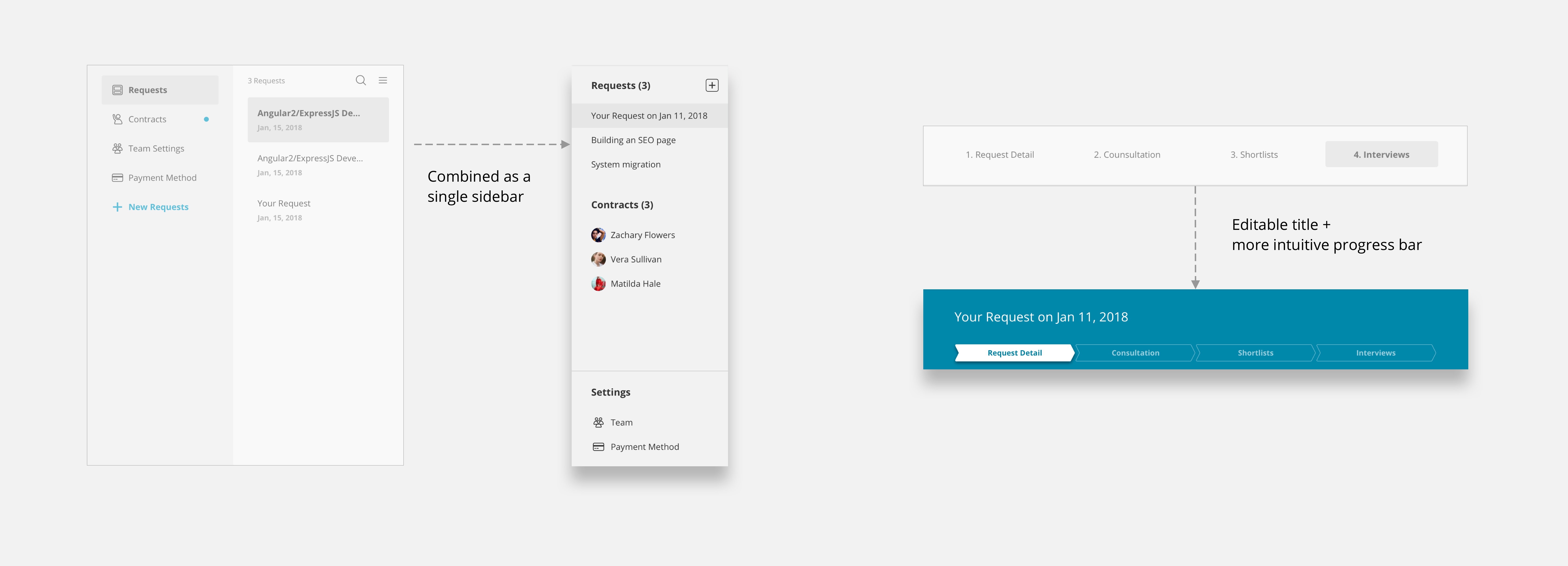
Iteration I:
Refine the Layout and Content Status Style
I conduct a few internal usability testing, and according to the feedback I got, I made following iteration for the layout:
Single column side menu: users feel that the request and contract list (second column) don’t need to take a whole column because they probably won’t have “a lot” of requests or contracts. Also, users can’t focus on the main content immediately because this two-columns-menu takes too much space
Progress bar: users don’t feel like it’s a progress bar because the relationship between each step is not obvious enough
Main content interaction: the interaction in the shortlist step and the interview step is not intuitive, and users can’t figure out what to do with the UI
Main content layout: some users are confused by the two different layouts between “Request detail” and the other steps. They don’t feel they are in the same process

Iteration II:
Add the “Reschedule” Feature
After discussing this prototype with the PM, we figured out that we hadn’t designed the “reschedule” feature. So I added this feature in this iteration. When clients click on the reschedule icon, it will open an external link for rescheduling.
Design II:
Contract Page
Start Contract
Contract Detail
Payment Set Up
Start Contract:
Set Up a Project Agreement and Sign Contract, as a Reminder but not Mandatory Requirement
To allow clients to start the page on their own, there are two things clients have to do on the contract page: sign the contract and initiate the protocol of collaboration. We considered two types of design, making it mandatory for the client to complete both of them to start the project, or simply make it a reminder which they do not need to complete before starting the projects. We finally decided to go with the “Reminder” because we reckoned that making it mandatory might be too pushy.
Contract Detail:
Reuse and Adjust the Old Design
For the contract detail, because the content and design already existed in the old design, and the design research showed that there’s not much need to be improved in this part, I reused the old design but made a few modifications for the layout so it aligned with the new design.
Payment Set Up:
Handle the Edge Case
Although usually our salespeople would help the client set up their payment method in the early stages of the hiring process, there would be some cases where they don’t from time to time (e.g. they wanted to speed up the process for certain clients). However, making sure clients have a payment method in our system was crucial for us to make sure we will receive the payment. So I designed a page to handle this type of case. Clients have to add a payment method before they can see anything in the dashboard.
Design III:
Others
The Team Feature
Intercom
The Team Feature:
Allowing Multiple Team Members to Join the Hiring Process
The team management page here is quite standard and simple. Clients (the owner, i.e. the person who made contact with us in the first place) can invite or remove people to/from the team. The owner can transfer the ownership in case the account “owner” is not the actual lead of the project.
Intercom:
An Alternative Way for Clients to Communicate with Sales Team
There’s not much design in this but just a decision. I originally planned to design a lightweight chat room in the new dashboard, but it turned out to be too much effort for the dev team. At the same time, we realized that our sales team used Intercom in our other products. In addition, Intercom can be integrated with Slack, by which salespeople can reply to the message more in time. Therefore, we decided to use it for communicating with clients in the dashboard.
Design
Spec
The Final Step Toward Success
Making the design spec that is easy for developers to read is always the best practice at the end of a project. At Codementor, I will always create an interaction/layout instruction like this for developers, uploading them to Zeplin along with the design of each screen. In addition, I will also write up a comprehensive spec in a Github issue.
Outcome
What Sales Team Said
Clients and Revenue Growth
What Sales Team Said:
“The new design really helps a lot, now I can focus more on turning leads into real clients”
One of our salespeople said this in our all-hands meeting after a few weeks we launched the new design. It was really rewarding to hear the stakeholders say that!
Clients and Revenue Growth
After we launched the new design, along with several iterations, improving and adding more relevant features, our clients and revenue grew nearly 2 times in around 1 year. It is definitely not only because of the new design. It definitely is the team effort that made this happen. But I’m glad that the new design can help the team achieve such accomplishments.
Conclusion
What Can Be Done Better
What I Learned
What Can Be Done Better
First of all, this redesign was only the beginning. Plenty of features are not designed perfectly. For example, the “reschedule” and the “shortlist” page should probably be combined into the main dashboard. In addition, as we learn more from the users (clients), and as our sales strategy changes, there will be more iteration and improvement.
What I learned:
Communication, Collaboration and Product Sense
This project pretty much summarizes what I learned in my entire time working at Codementor. The biggest takeaways from my journey at Codementor is that I learned how to collaborate with PM, developers, and other team members, working together to make the product and the company better. As a designer, I do not only think from design and users’ perspective, but I also learn how to think from a business perspective. And equally if not more importantly, learning other roles’ language is also a key to success. You can only work together and roll out products smoothly when every role can put themselves in others’ shoes.
I’m truly grateful for everything I learned and experienced at Codementor. Don’t forget to check what they are doing right now!