Fulcrum
Period: 2021
Expertise: product design
Team: Jon McGlone (D+FE, Manager), Shih-Yu Chu (AD)
Help Users Understand the Access Levels and How to Get Access to a Resource in eBook Collections
Problem
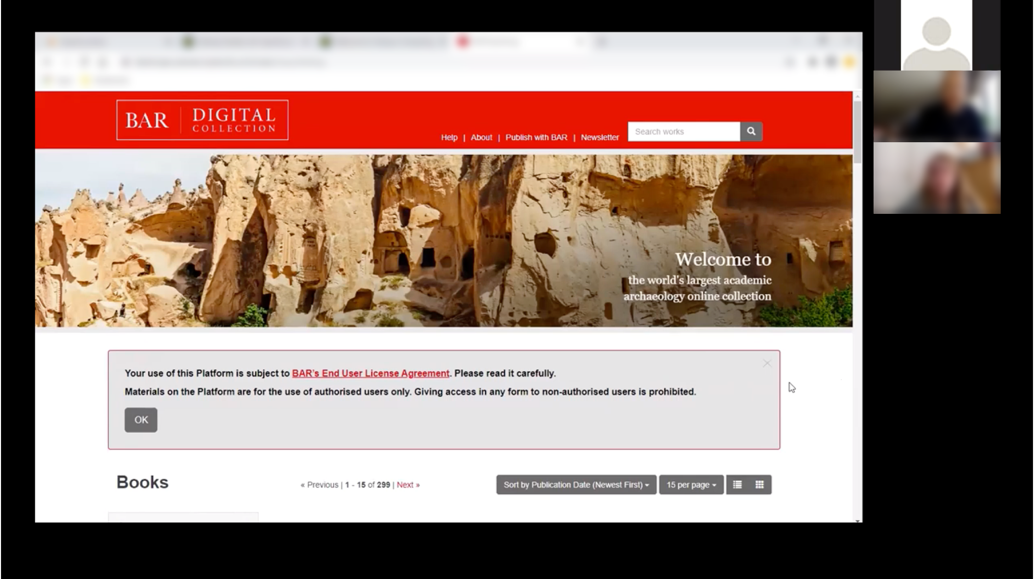
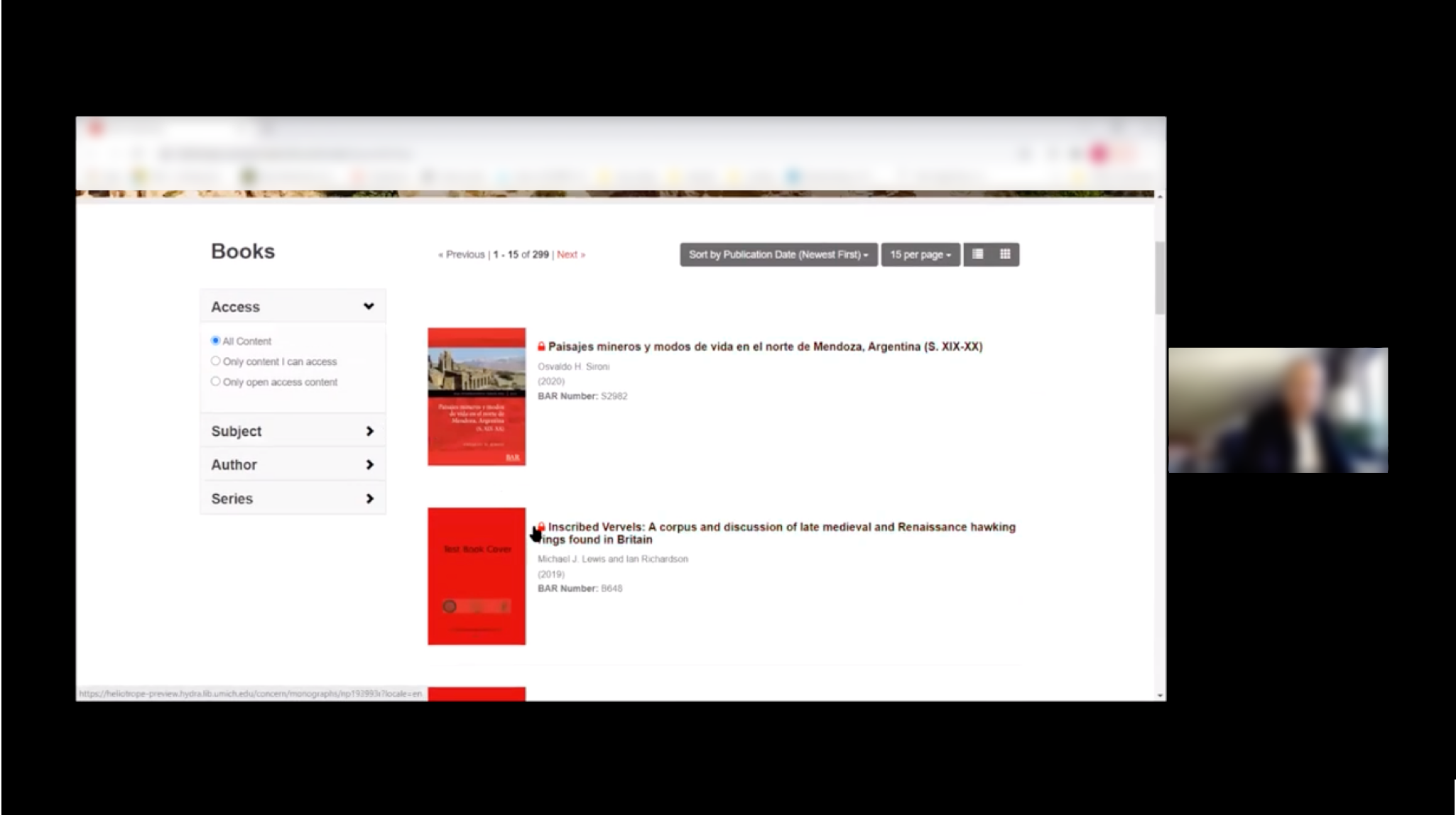
Fulcrum is a product that provides publishers a platform to present their eBook collections. As Fulcrum launched the “Access Level” features, we wanted to make sure that users understand the access level indicator, and know how to get access to a certain resource (eBook).
Outcome
The usability testing suggested that users were having difficulty understanding access level, and it was unclear for them what to do to get access to a resource. To address that, we added a legend of access level, as well as redesigned the authentication / authorization flow.
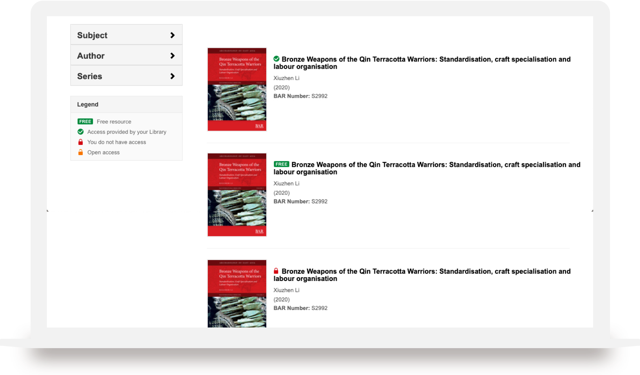
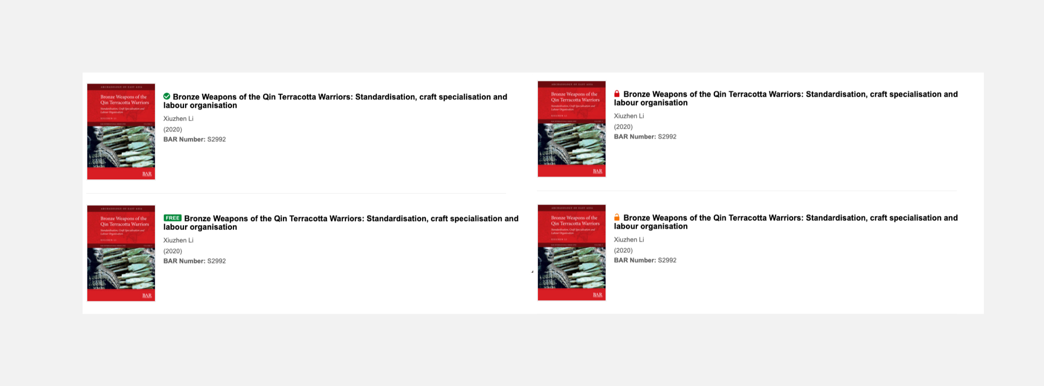
Access Level Legend
Added a legend for access level indicators, clarifying the meaning of each icon
Authentication
Always prompt users to log in first, and provide clearer user interface and flow for logging in
Authorization
Provide clear instruction for what to do to get authrized to an eBook
Usability
Testing
Testing sessions summary
System Usability Scale (SUS)
Testing Sessions Summary
At the beginning of the project, I helped with recruiting participants and fine-tuned the protocol. We had 5 participants. They were asked to complete 3 tasks in the testing session.
4 Participants
Participants included undergrad students (1), grad students (2), and librarians (2).
3 Tasks
Identify a title they (don’t) have access to
Filter to display resource they have access to
Figure out how to get access to a resource they don’t have access to
System Usability Scale (SUS)
At the end of the test, we asked the participants what SUS score would rate the system. We got an average score of 93.27, which means that the system doesn’t have major issues that needs to be addressed immediately.

Key Findings &
Design Scope
After we synthesized the findings and prioritized them and turned them into action items, we decided to focus on two things:
Access Level Indicator
We wanted to have a new design that can eliminate the confusion about access level between different resources.
Authentication Flow
Based on the testing results, we realized that the information on the “access option” page is not clear enough for the users. We wanted to provide clear instructions, and help them navigate through the authentication and authorization process.
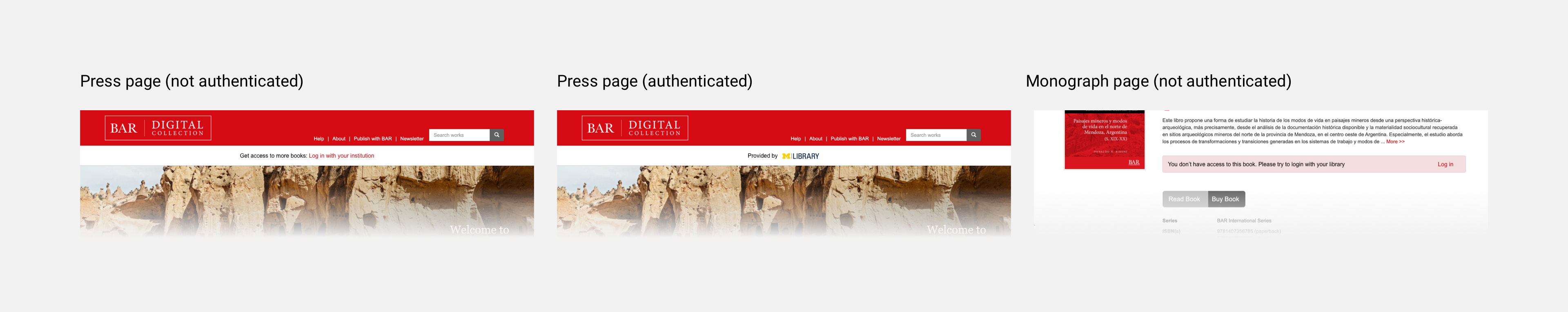
Access Level Indicator:
Design
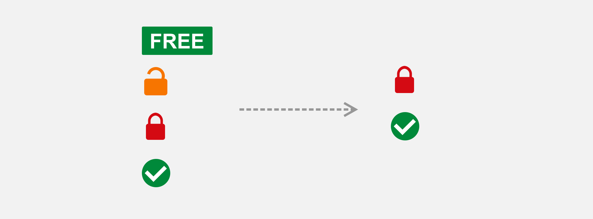
We have four different types of access level: Free, Open Access, Authorized, No Authorized. The first idea I have is to simply remove the icons that confuse users, i.e. only keep Authorized, and No Authorized icons. However, our clients (publishers) rejected this idea for two reasons, first these four levels are kind of a standard in the industry, and second, they want to keep certain level, e.g. Free, for promotional purposes.
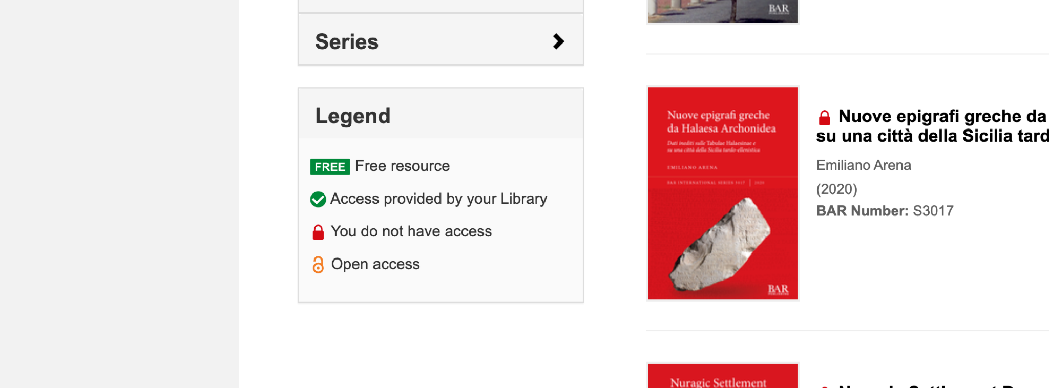
Therefore, we came up with a solution to address the issue: adding a legend. We asked our participants for feedback on this design, and most participants think it will be helpful.
Authentication:
User Journey
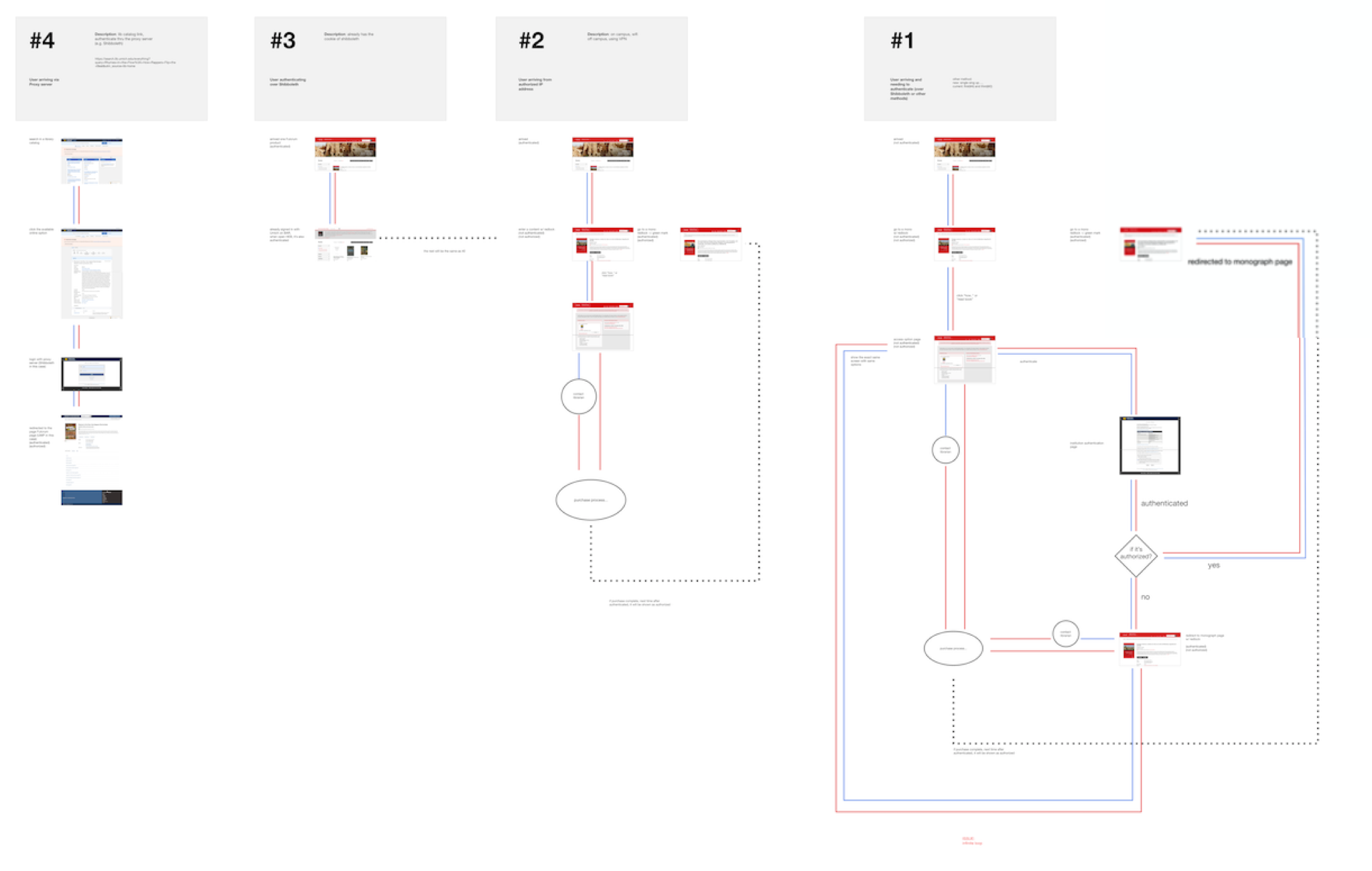
I plotted out the current user journey to further investigate if there were any potential problems that were not mentioned in the testing. We found out that, when an authenticated user wants to get authorized for a resource, if they go to the access option page, they will see the exact same content as when they’re not authenticated. And the fundamental reason is that:
"The access option page is mixing the flow of authentication and authorization together"
Authentication:
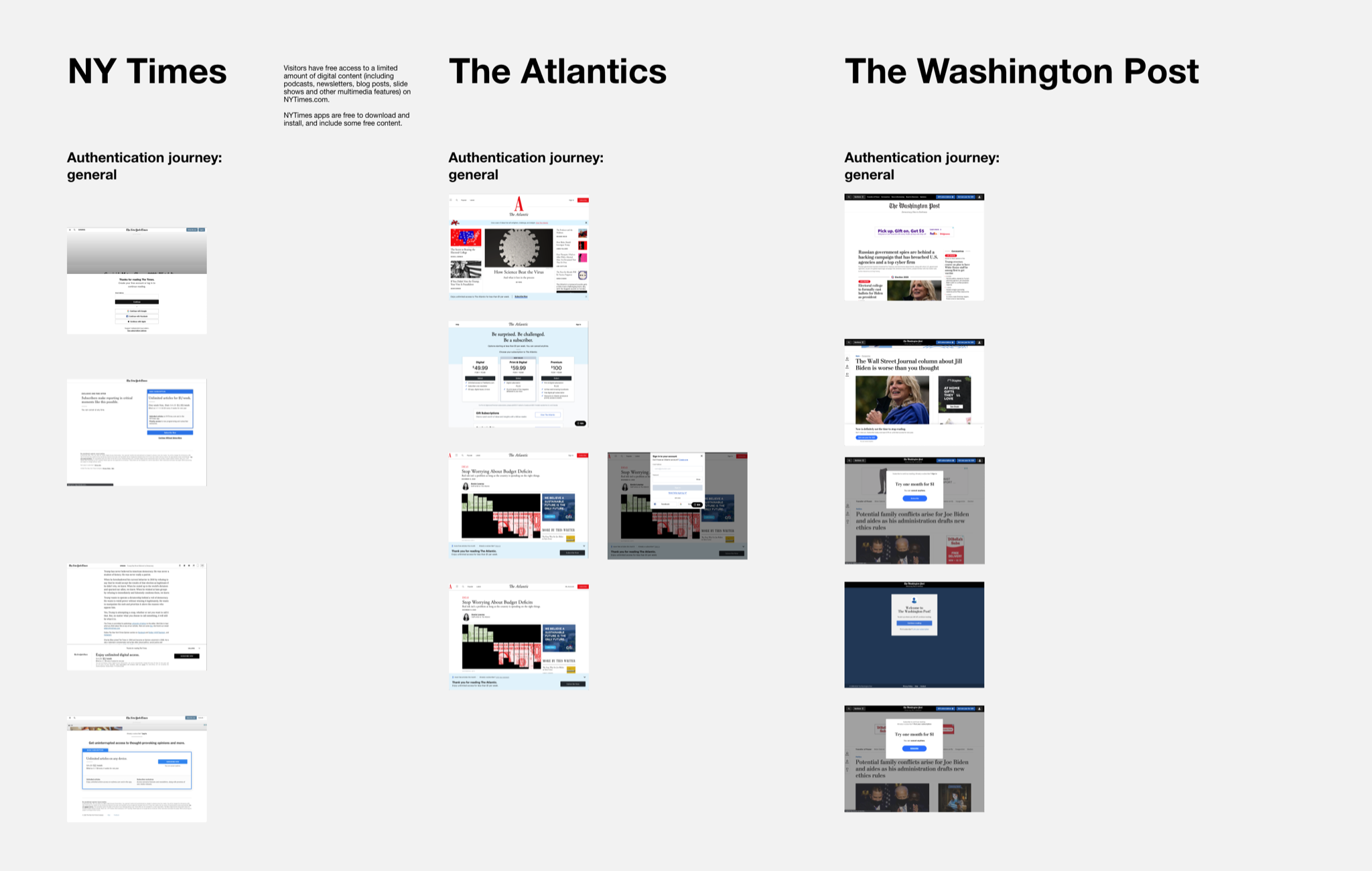
Competitive Analysis
Direct competitors
Indirect competitors
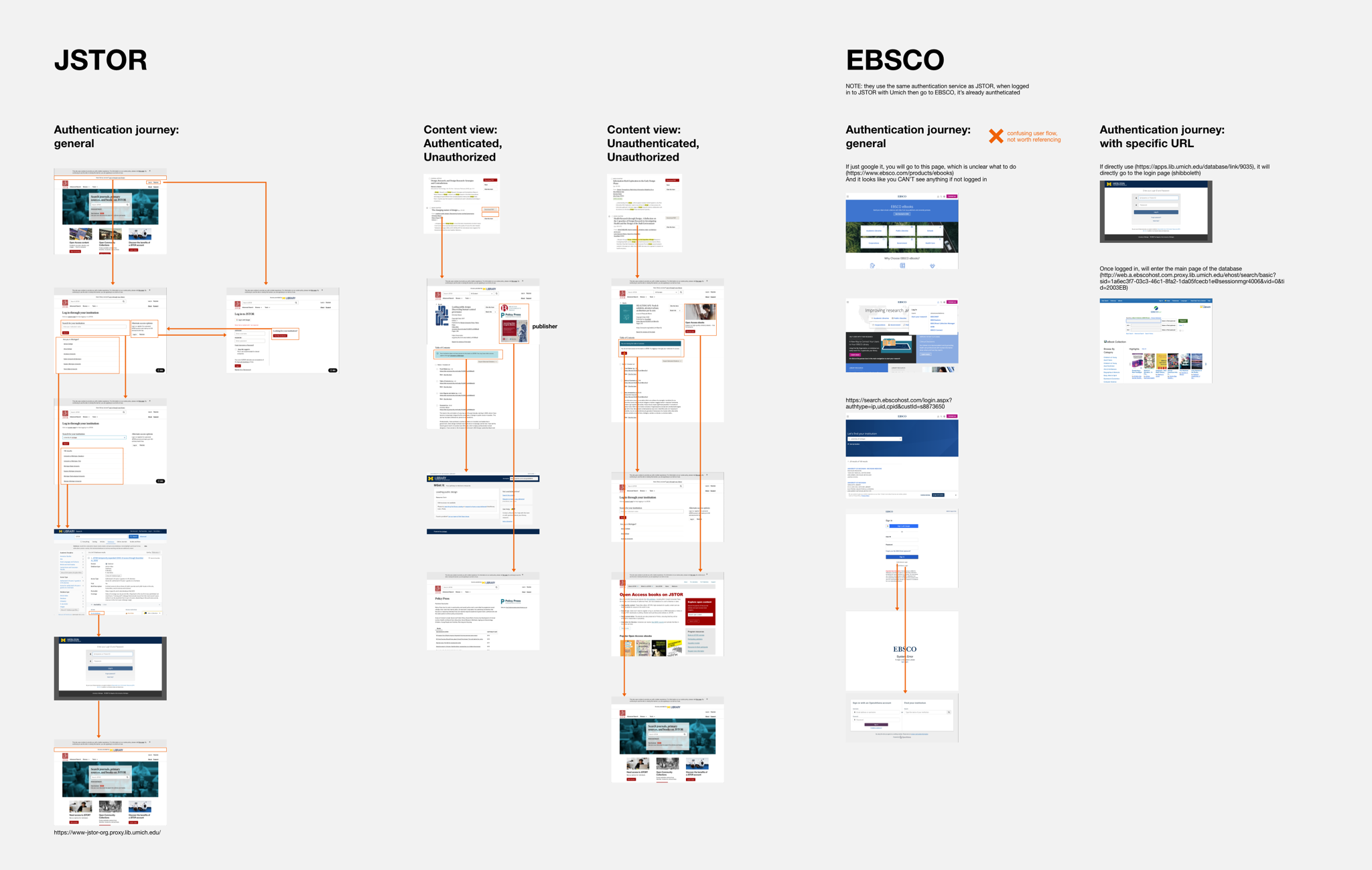
Direct Competitors
We looked into competitors like JSTOR, EBSCO, etc., to see how they design their authentication flow. The main takeaways are:
1.
All of them prompt users to log in (authenticated) upfront
2.
They also separate the process of authentication and authorization
Indirect Competitors
We also investigated some news websites, specifically learning how they present their paywall (i.e. their user interface design) and prompt users to subscribe.
Authentication:
Design
Two separate paths
Login prompt
Login page (authentication)
Purchase page (authorization)
Two Separate Paths
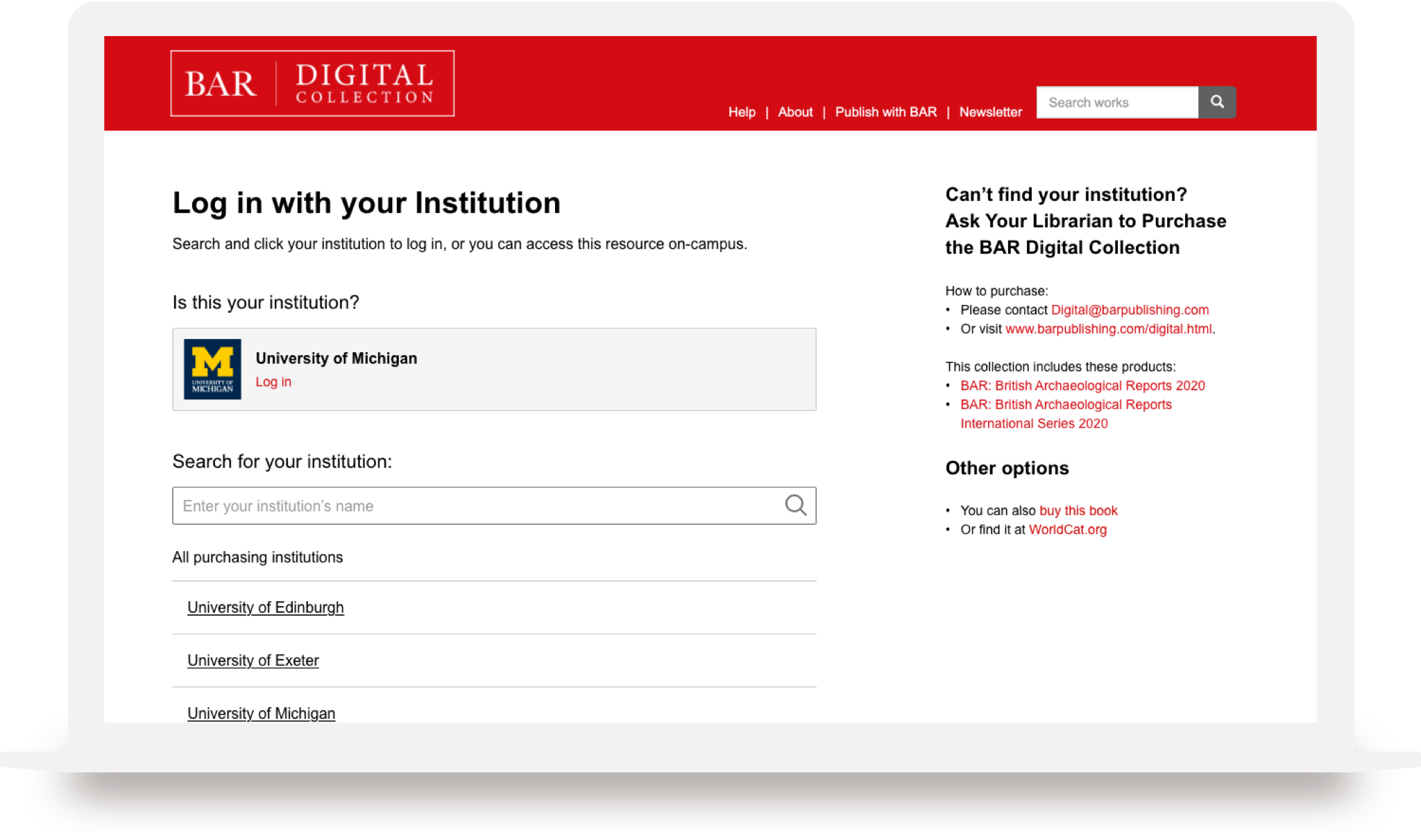
We discard the original “Access Option Page”. And the UI will always (and only) prompt users to log in if they’re not authenticated. Once they’re authenticated, the UI will show information regarding that.
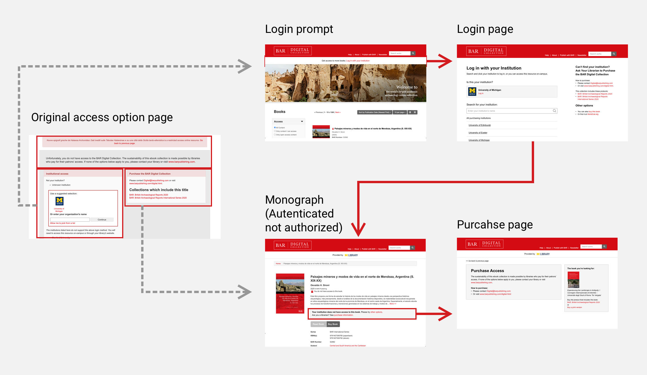
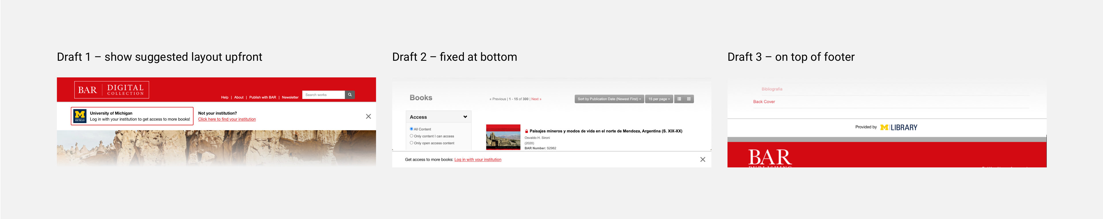
Login Prompt
Based on the competitive analysis, I came up with some wireframes about how we prompt users to log in. Eventually we chose the JSTOR like methods, which is the most clean and elegant way to present it.
Login Page (authentication)
For the login page, we customized Shibboleth’s widget (a third party login service used by Fulcrum) and increased the hierarchy of the information in this page, in order to provide a clearer instruction. On the left side, it’s the main section for login. On the right side, we provide alternative options for users in case they can’t find their institutions to login.
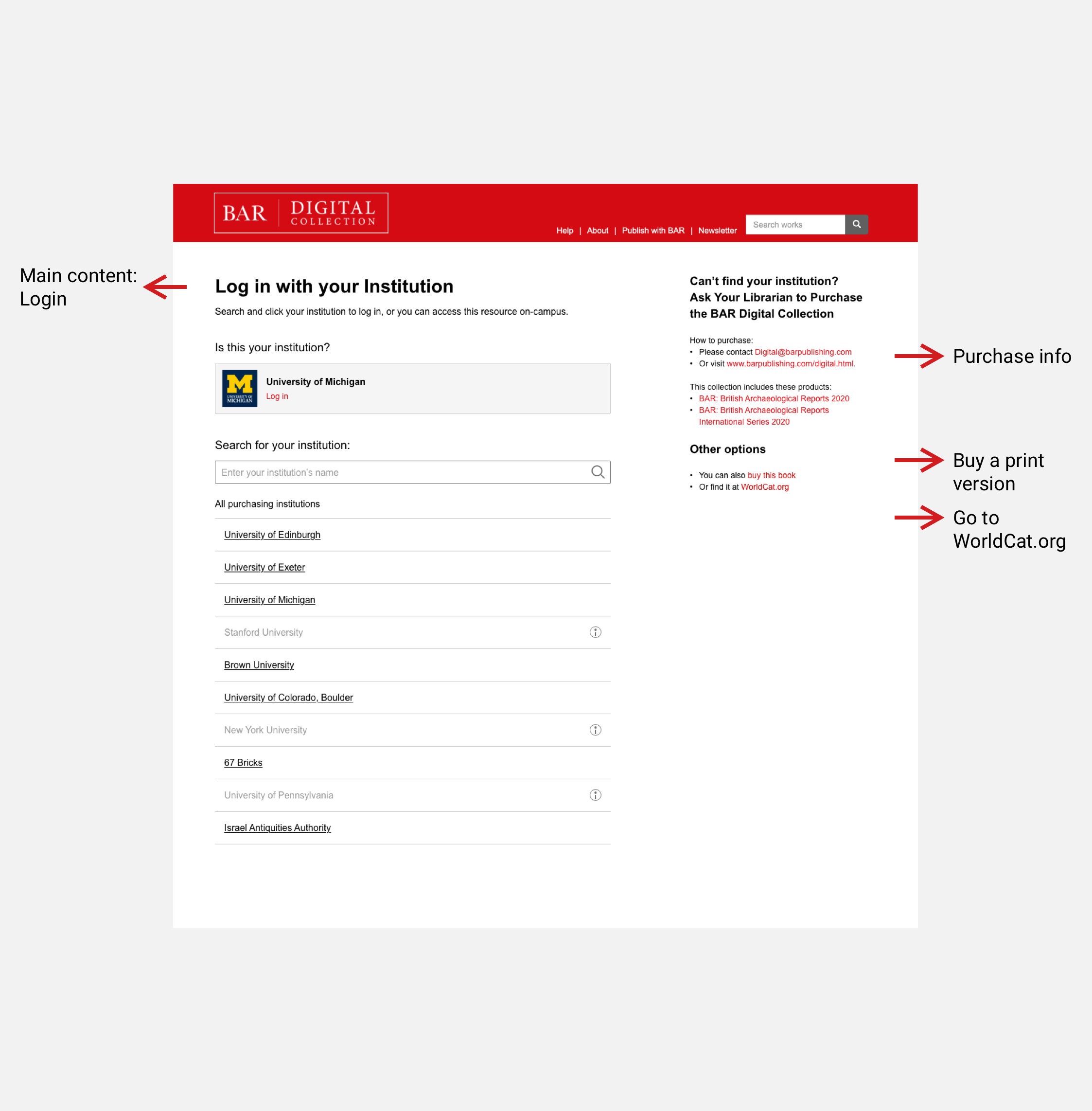
In the old version, it told users that they have several options for login (including Shibboleth, on campus, and their institution’s website). However, the testing results suggested that users cannot understand it, or barely read it. Therefore we simplified the interaction: no matter what login method the institution supports, the only users need to do is find their institution and click the link.
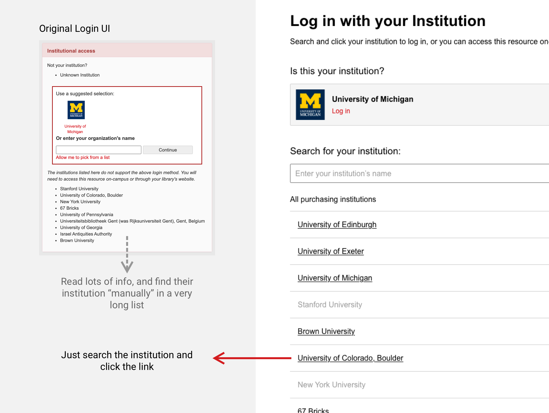
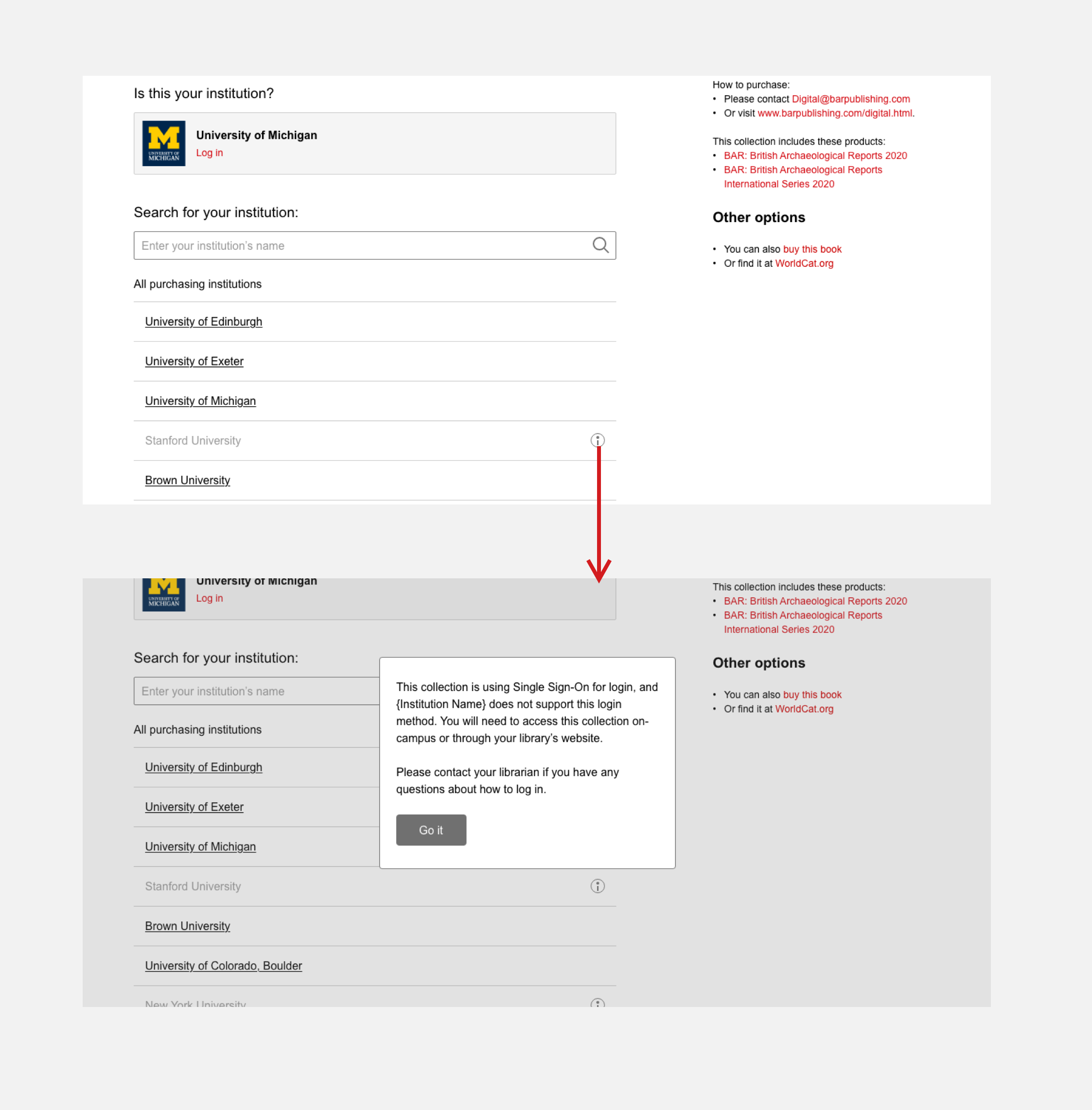
For handling the edge cases where we cannot get any links for certain institutions, we provided an “info icon” and told them what to do.
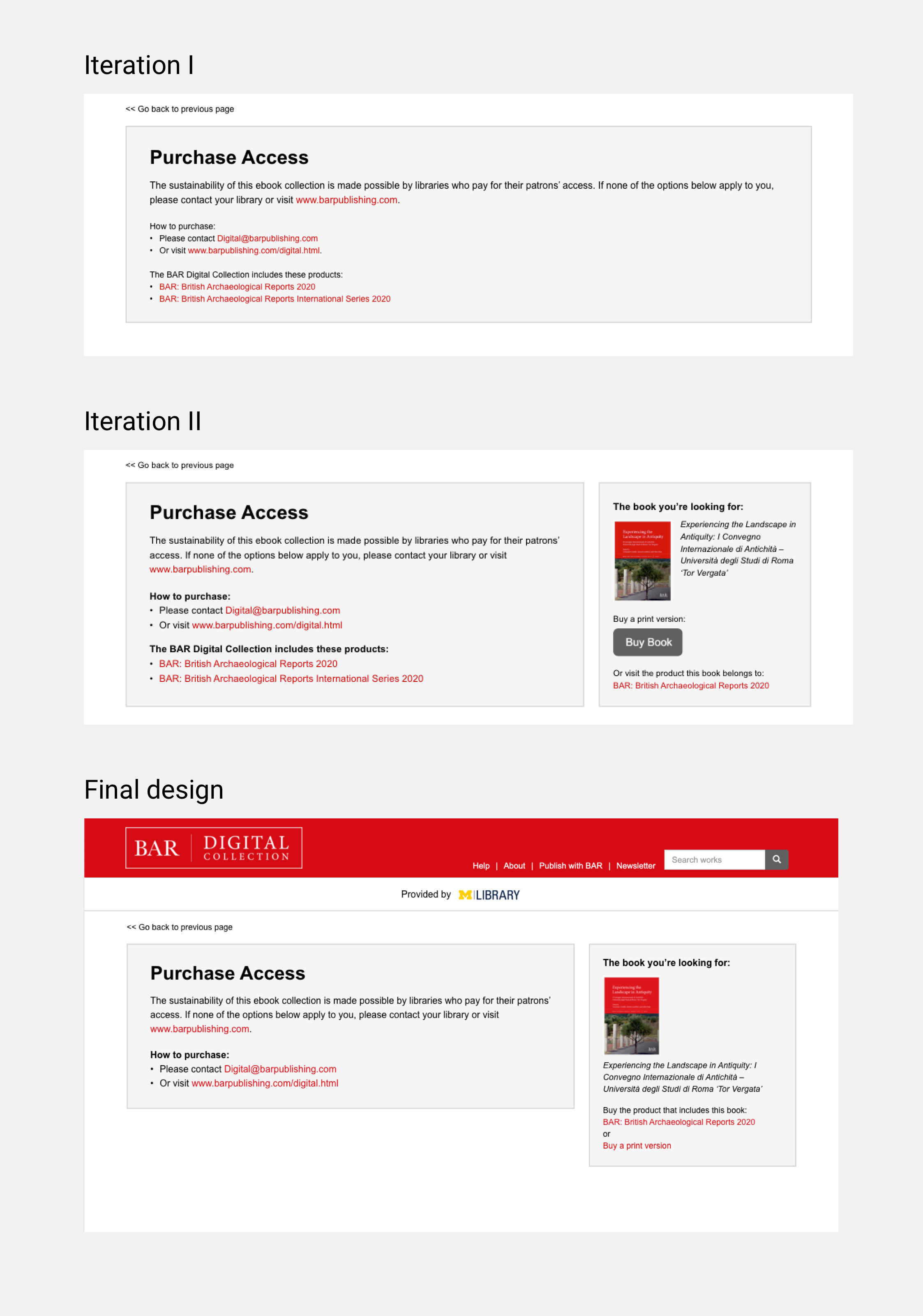
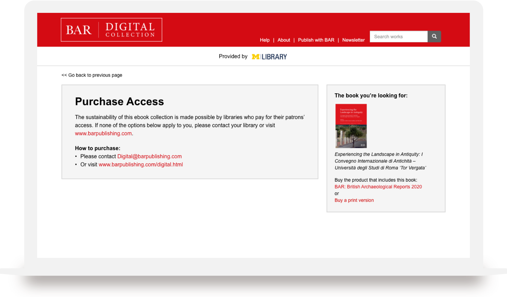
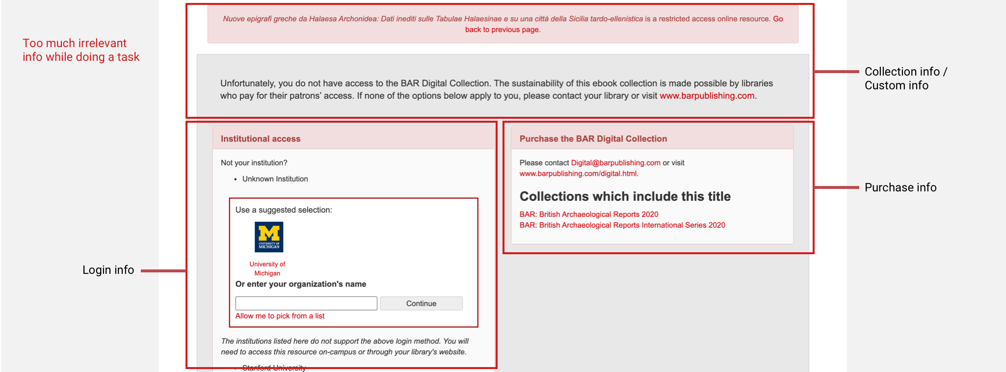
Purchase page (authorization)
If a user gets authenticated but not authorized to a book, in the “monograph” page the UI will prompt them to try to find it at their institution (link resolver), or go see purchase information.
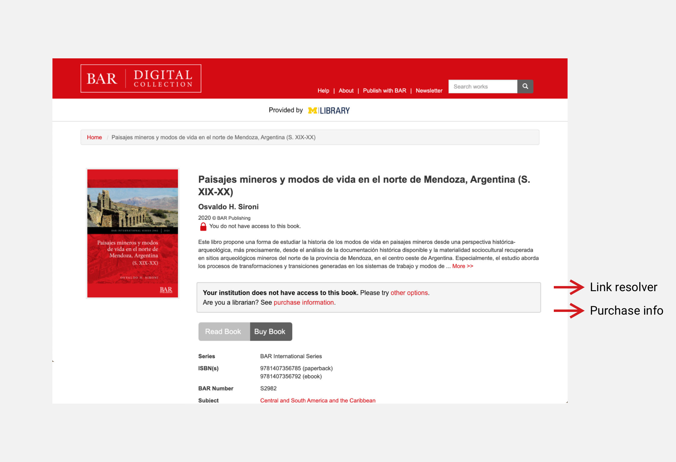
On the purchase information page, on the left we pull the existing information from the previous page, which is the general information about the collections. After some internal feedback from colleagues, we decided to have a subsection on the right, presenting the information of the book users were looking for in the previous page, which is a stronger call to action for them to purchase.