CM Style Guide
Period: 2018 - 2019
Expertise: design system
Team: Vita Tseng (D), Yvon Huang (D), Pei-Yin Lin (D), Viki Huang (D), Shih-Yu Chu (D)
Cross Products Design System
During my time working as a product designer at Codementor (CM), the company has two major products: Codementor and CodementorX. Codementor is the software engineering mentorship platform, while CodementorX is a freelance platform for software engineers. Other than that, we also rolled out some side projects or sub products from time to time. Each of these products is handled by different designers. Therefore, this project aims to create a guideline for designers to follow, trying to maintain the consistency across products in sake of branding, but still allowing designers to create the unique design for each product based on this guideline.
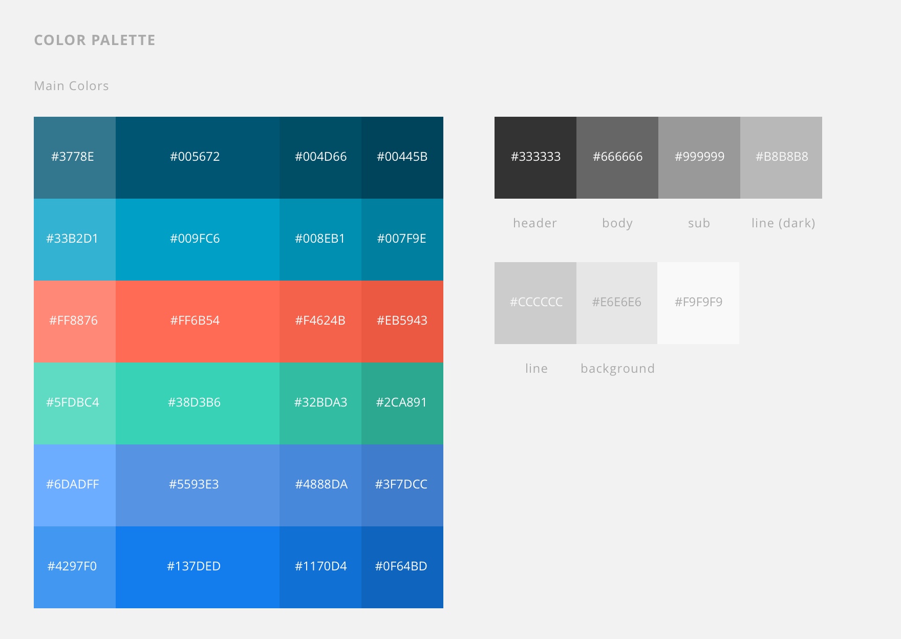
For the color palette, each product has its own unique color theme for branding, but all of them share the same color theme for common elements. Therefore, our main color theme comprises both the branding color theme and the common color theme.
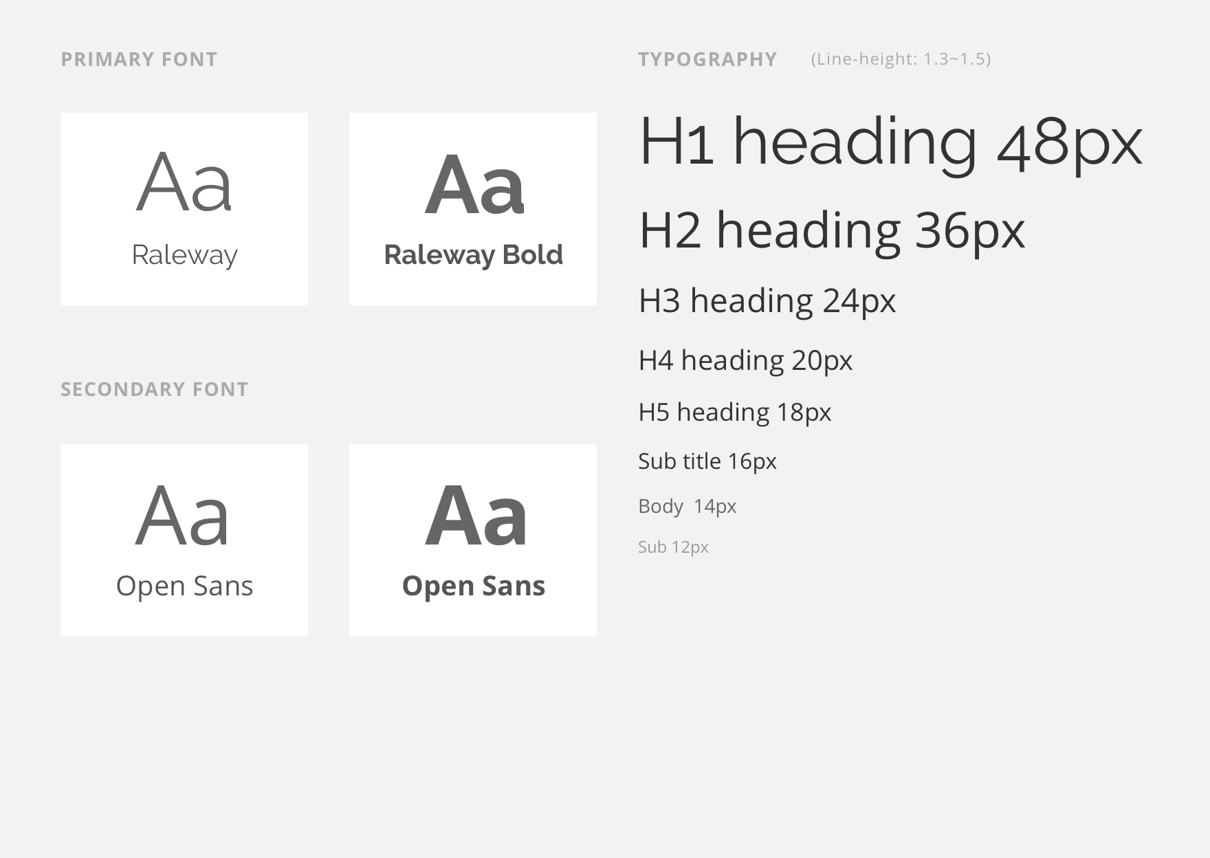
For the typeface, we choose Raleway for title and open sans for body text.
Define
Principles

Afterwards, we outline the principles for designing our shared design element and guideline, including dimension, element size, round corner, and element status. The goal of this stage is to minimize the options so we can have a more consistent interface across platforms, but allow designers to be able to have enough options to accommodate different situations. In case you’re interested why we’re using the 4px grid system, this article well explained our reasoning.
Use Case
Analysis
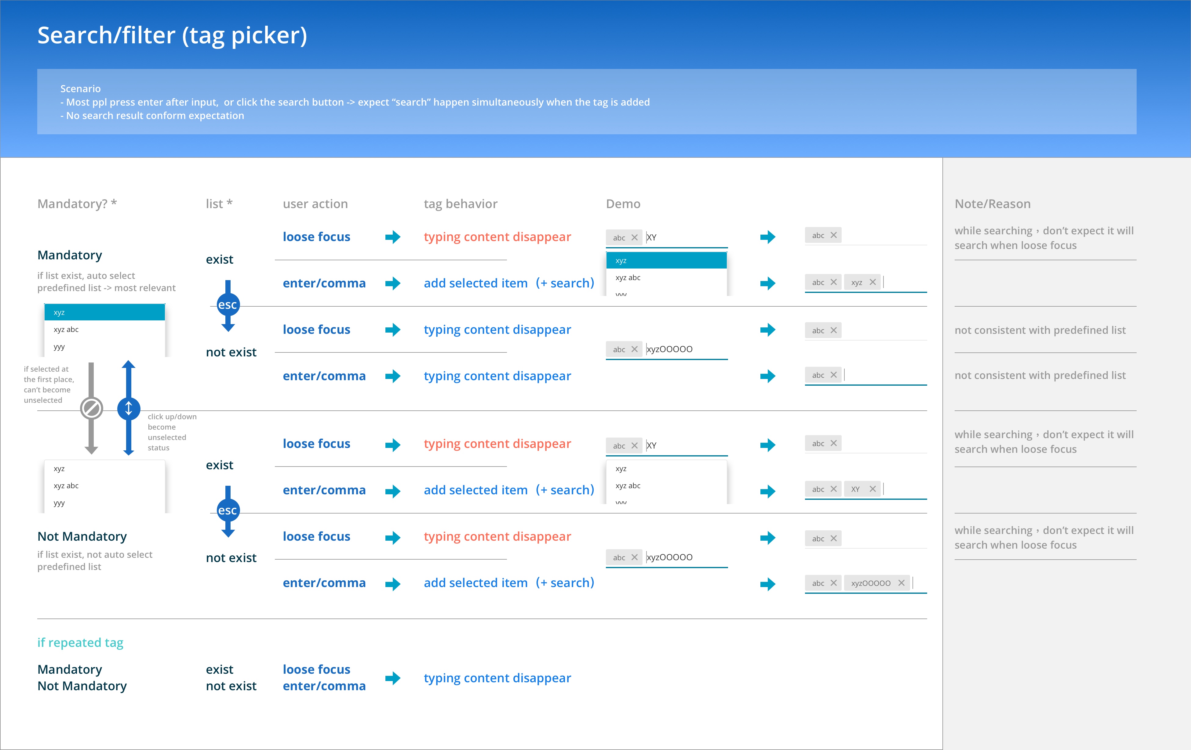
While we continue to build our shared design elements, we found the behavior of some elements are also inconsistent across platforms. Therefore we also look into and unify the use cases and the behavior of certain elements. Here’s one example I’ve done. We have a component called “tag picker”, which behaves differently across platforms. I make this chart to analyze its behavior, and discuss with my team about what is the best way to unify its behavior.
Shared Library
for Sketch
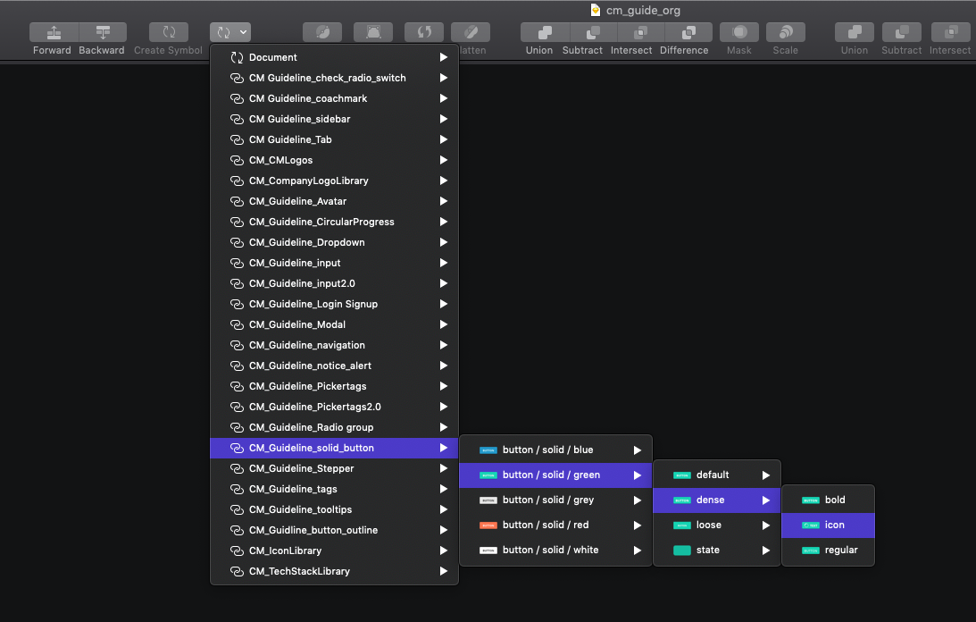
Insert button with different color and status
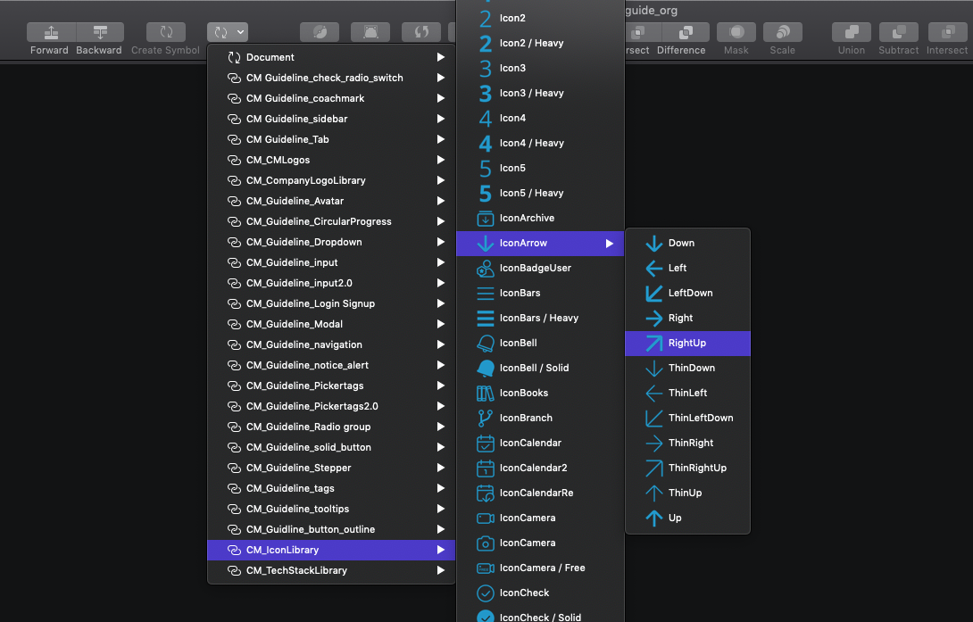
Icon library
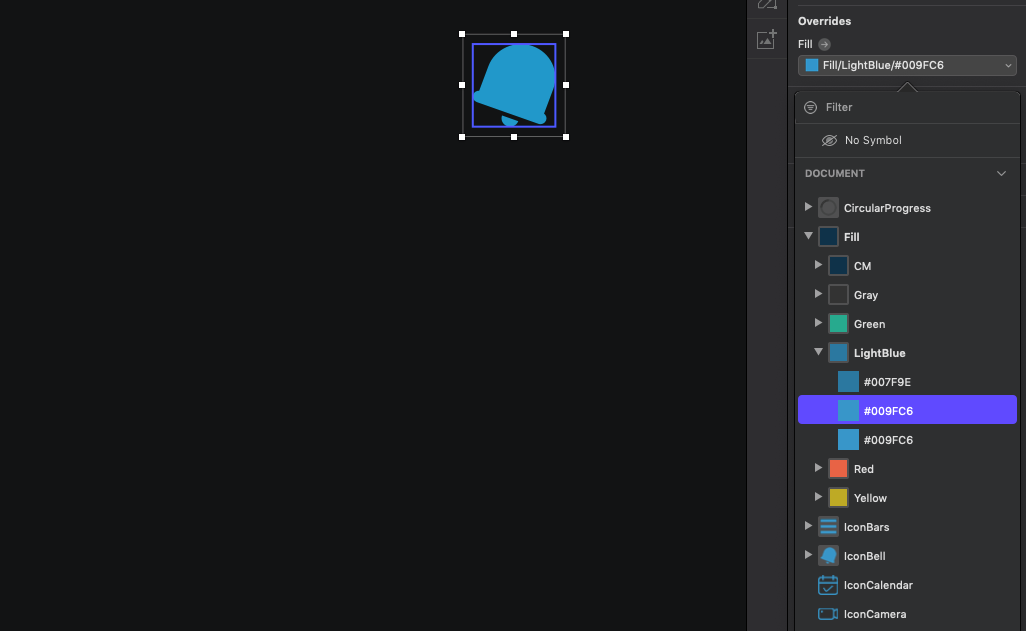
With nested component, the content and color of it can be easily changed
After we created our guideline, how can it really help the design team to work more efficiently? One of our senior product designers, Vita, comes up with a brilliant way to do that. Our team uses Sketch as our main tool, and its powerful “nested symbol” feature allows us to select all the components from the menu with different status and colors.